general brief
The redesign of SEVERNY packaging was aimed at solving several key issues: excessive busyness, inconsistent elements, and the absence of a unified visual system. Shelves with the products looked chaotic, and B2B clients noted that the design appeared too childish.
Task
The main objective was to create a more unified and mature visual style that would still preserve the spirit of the brand, rooted in nostalgia.
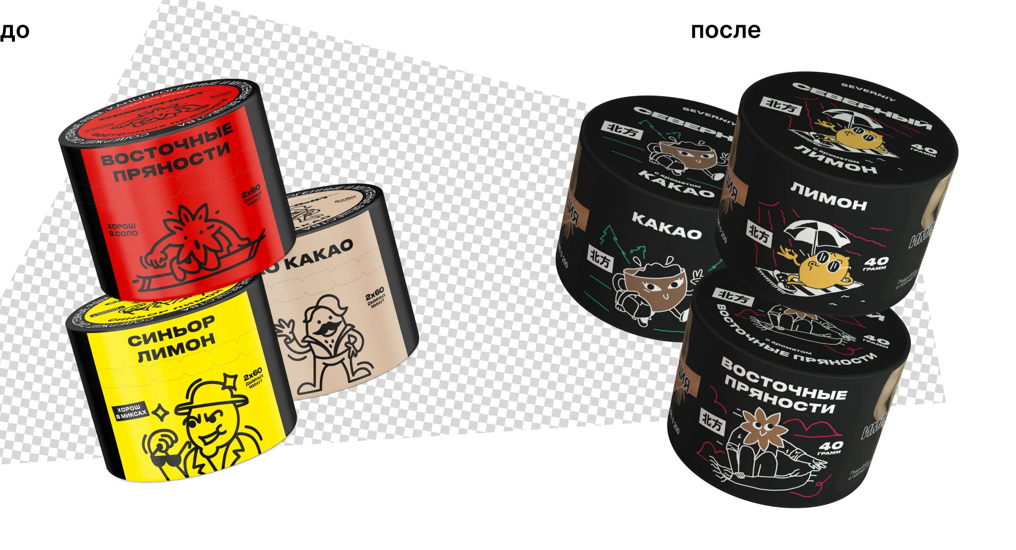
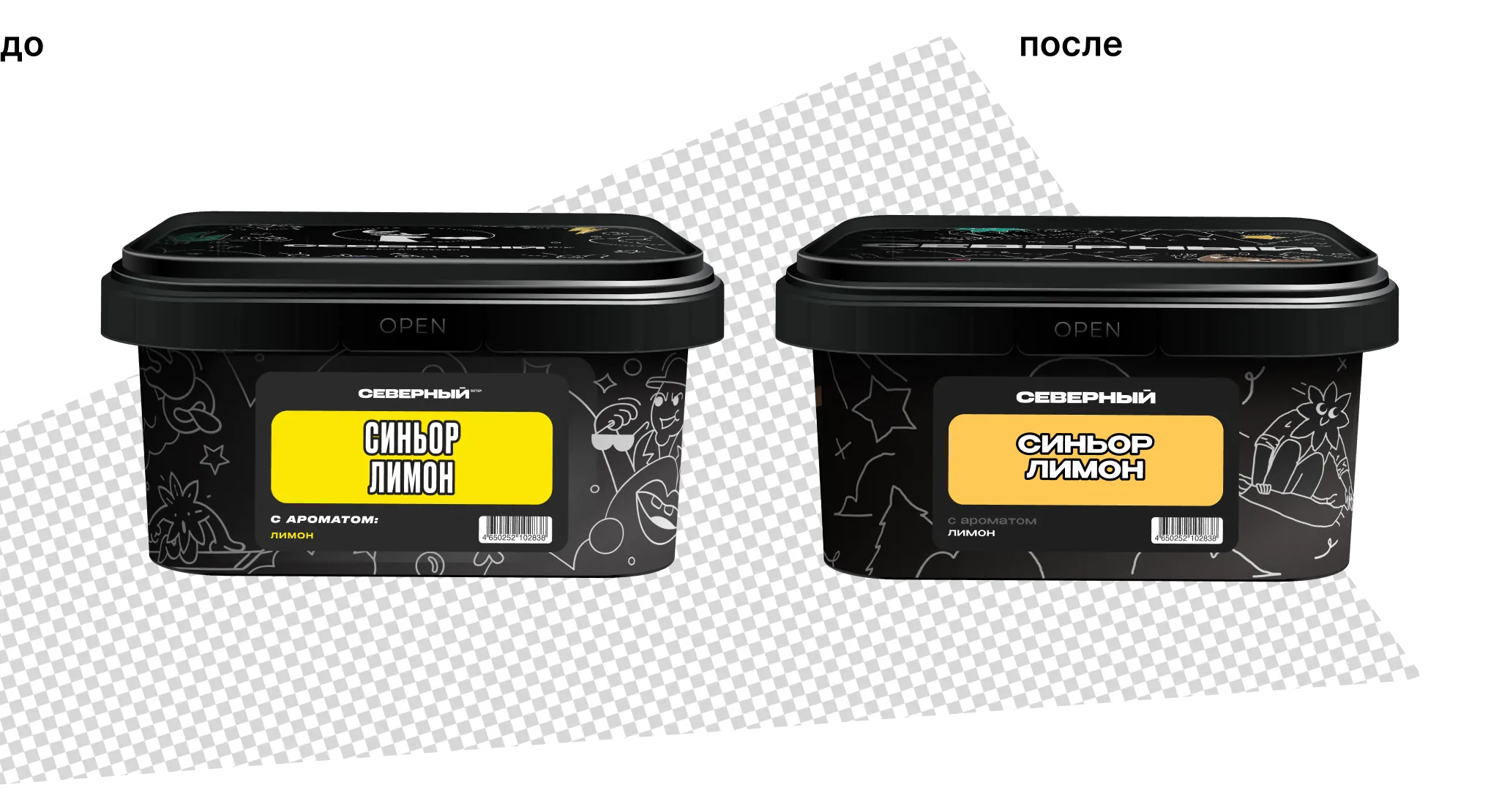
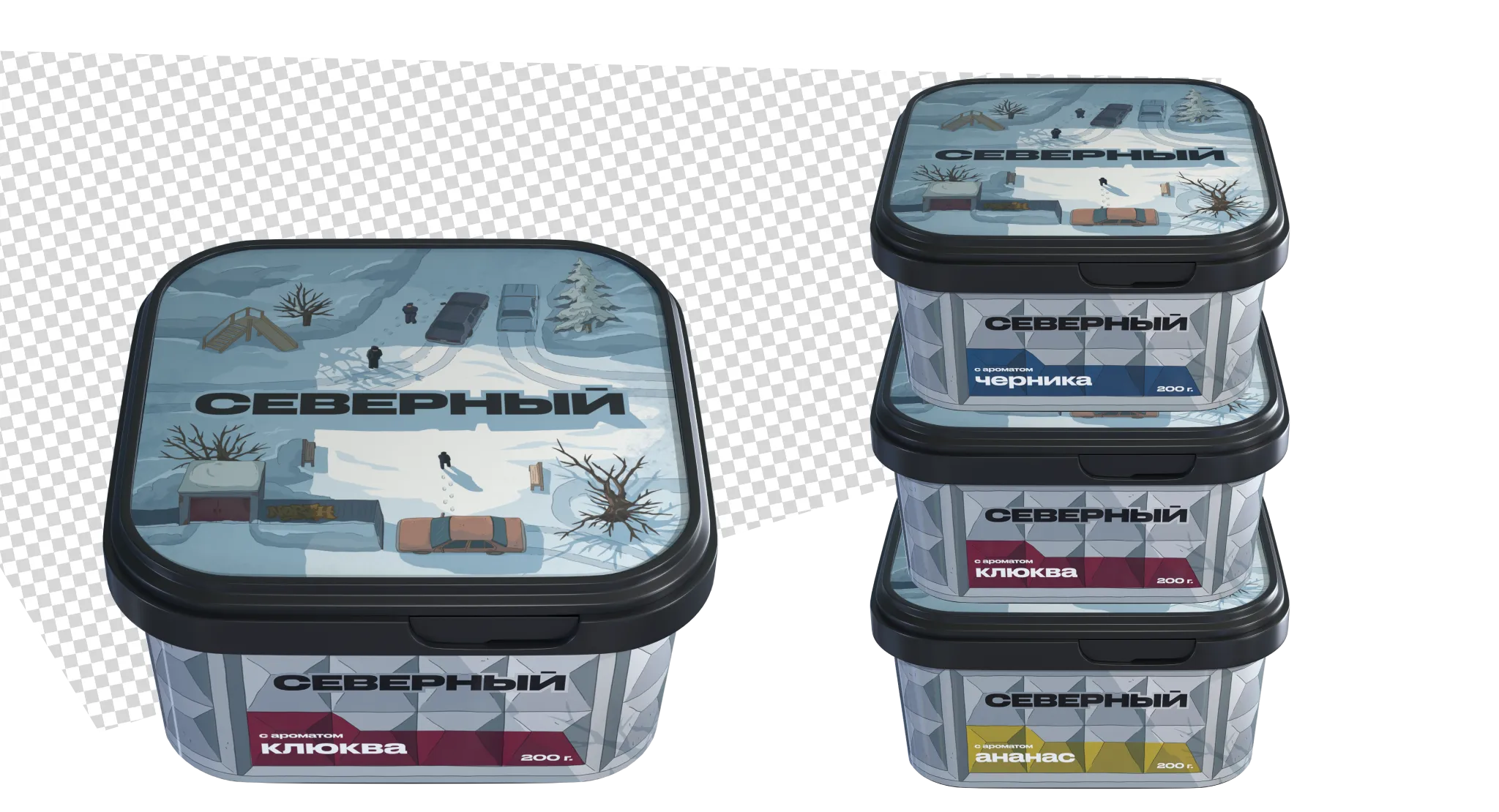
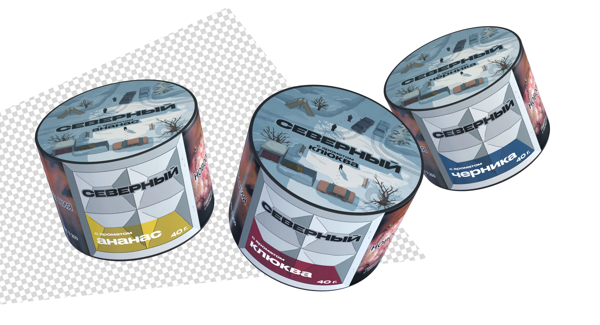
concept 1: illustrations
We created the first concept based on a design already familiar to the audience. However, the illustrations themselves became bolder, more character-driven, and stylistically heavier thanks to richer colors and solid shape fills.
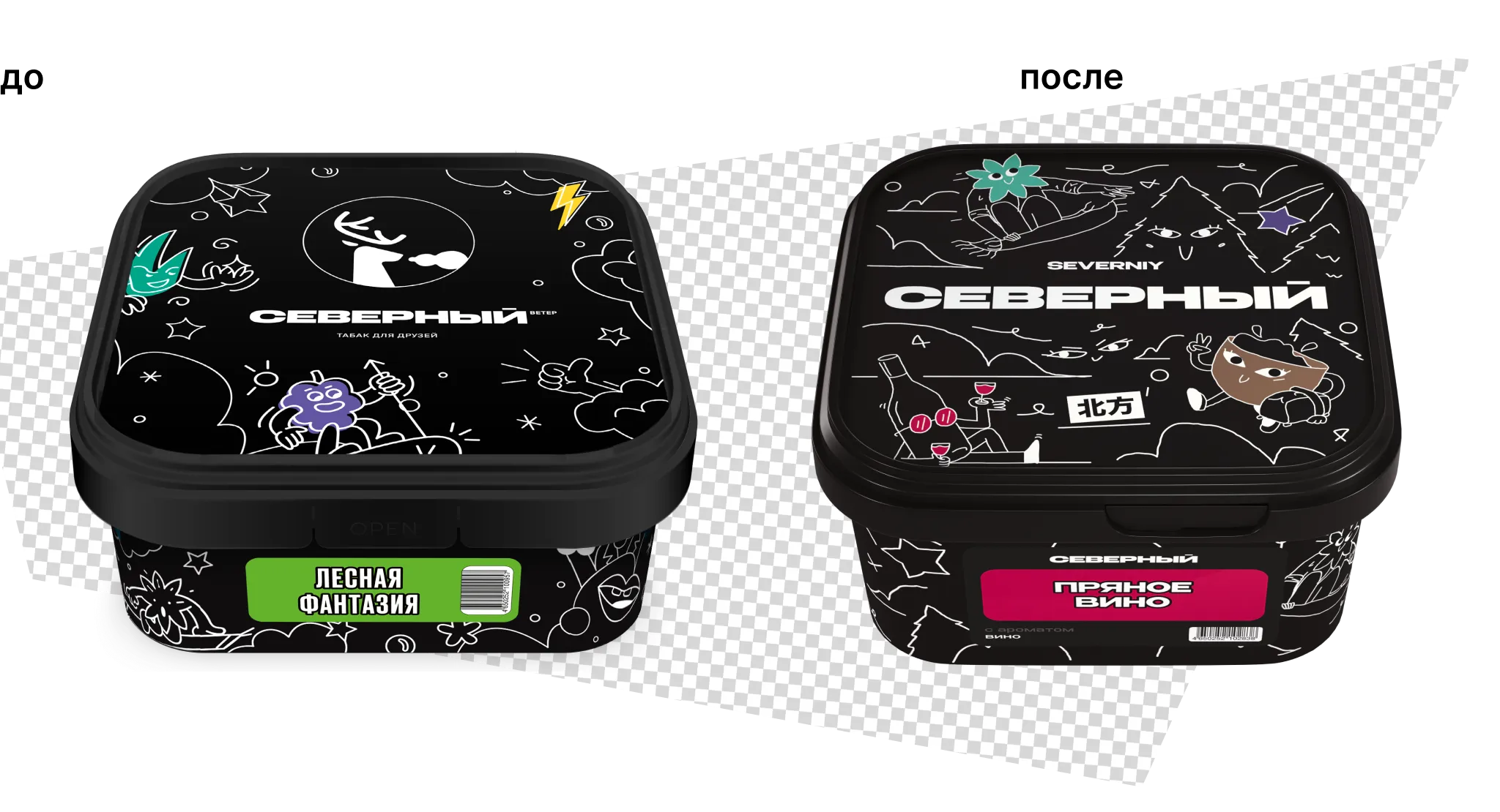
concept 2: nostalgia
The evolution of nostalgia in the brand is built on a simple and recognizable symbol — the fence, familiar to millennials (now aged 25–35) since childhood. This psychologically neutral element can evoke diverse emotions in the audience, making brand expansion feel natural.
concept 2: nostalgia
The connection with the name Severny is reinforced by associations with strength, solidity, and character. The fence underscores the brand’s strong and grounded identity, standing in contrast to lighthearted illustrations in the style of Keith Haring.
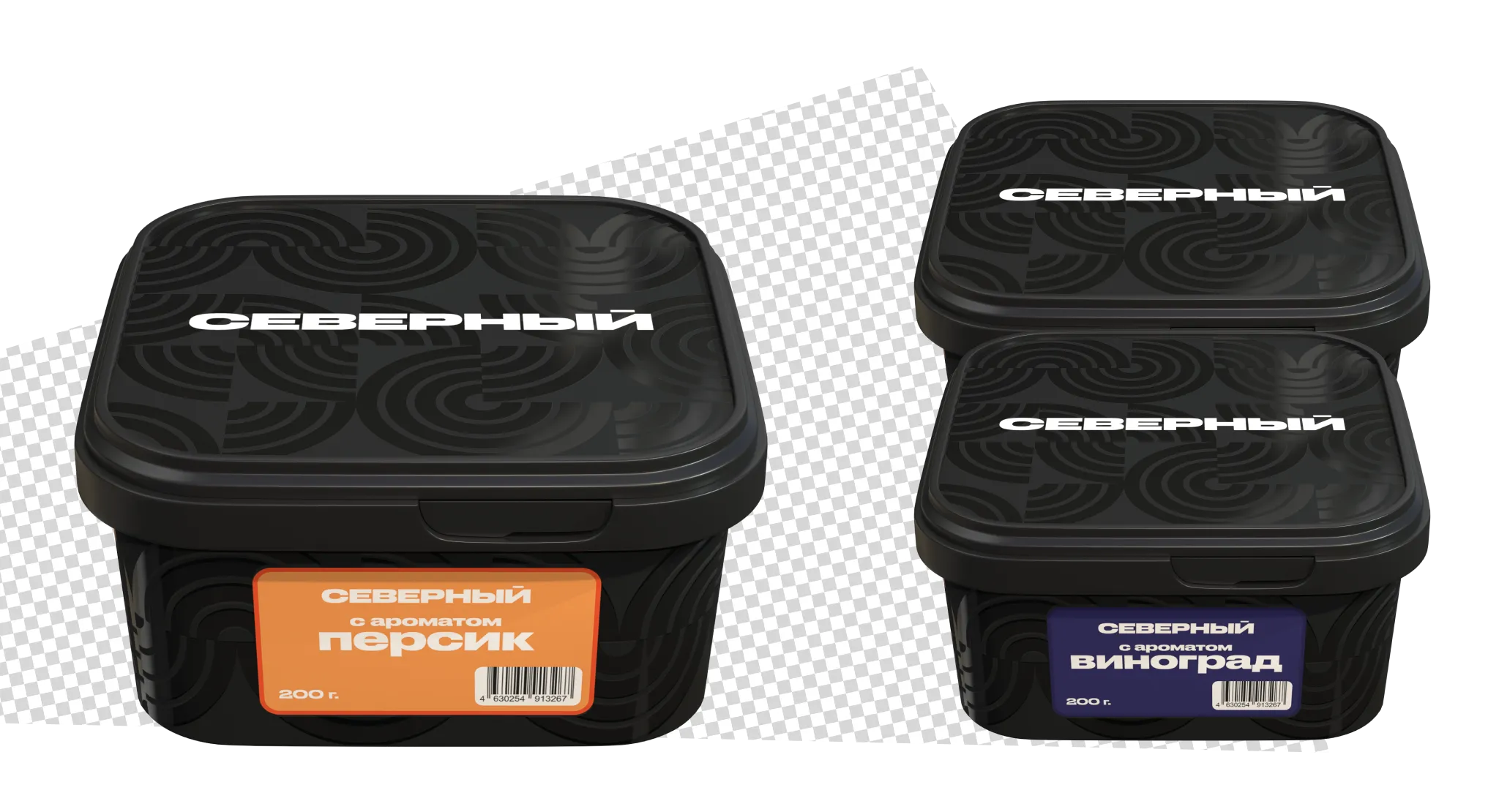
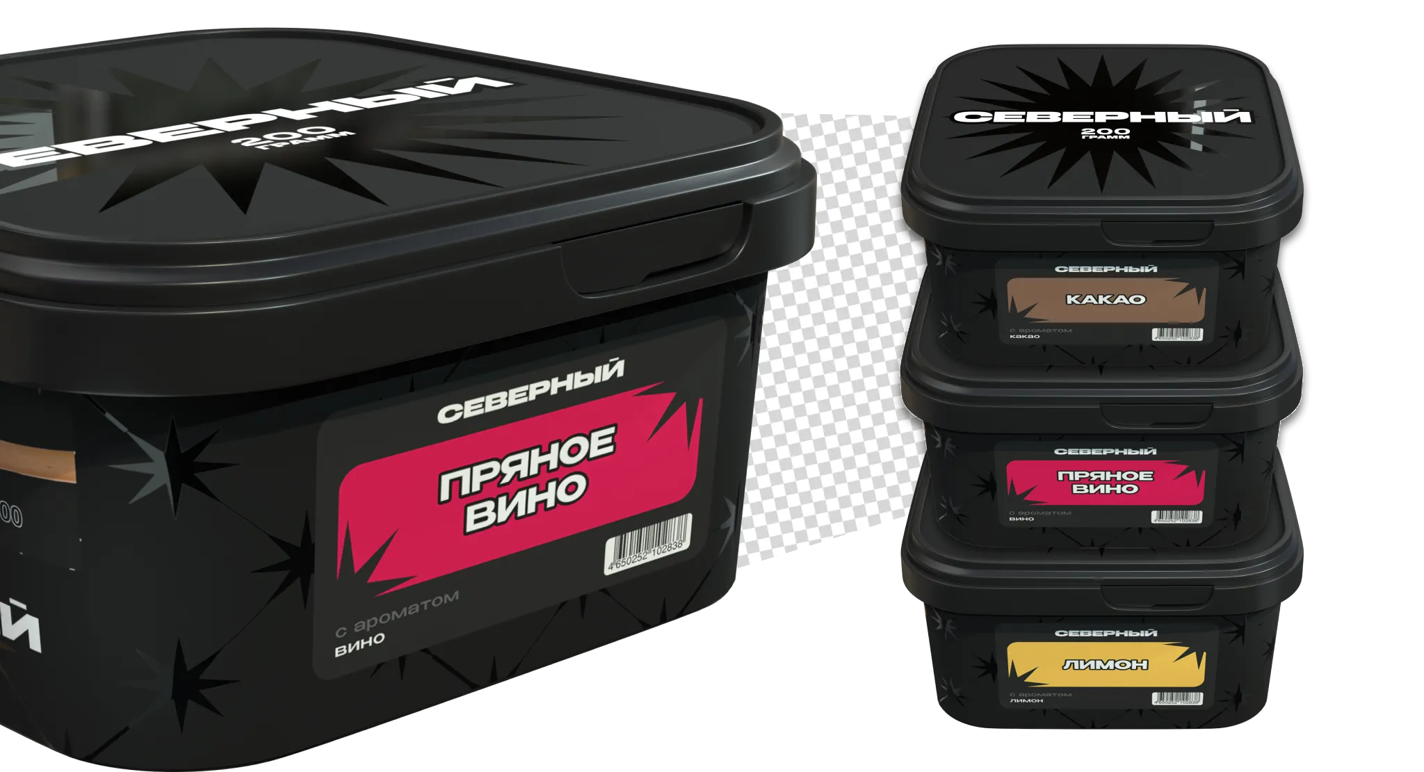
concept 3: minimalism
A return to classics — the deep, black Northern Star. Minimalist and noir. Simple and clear.
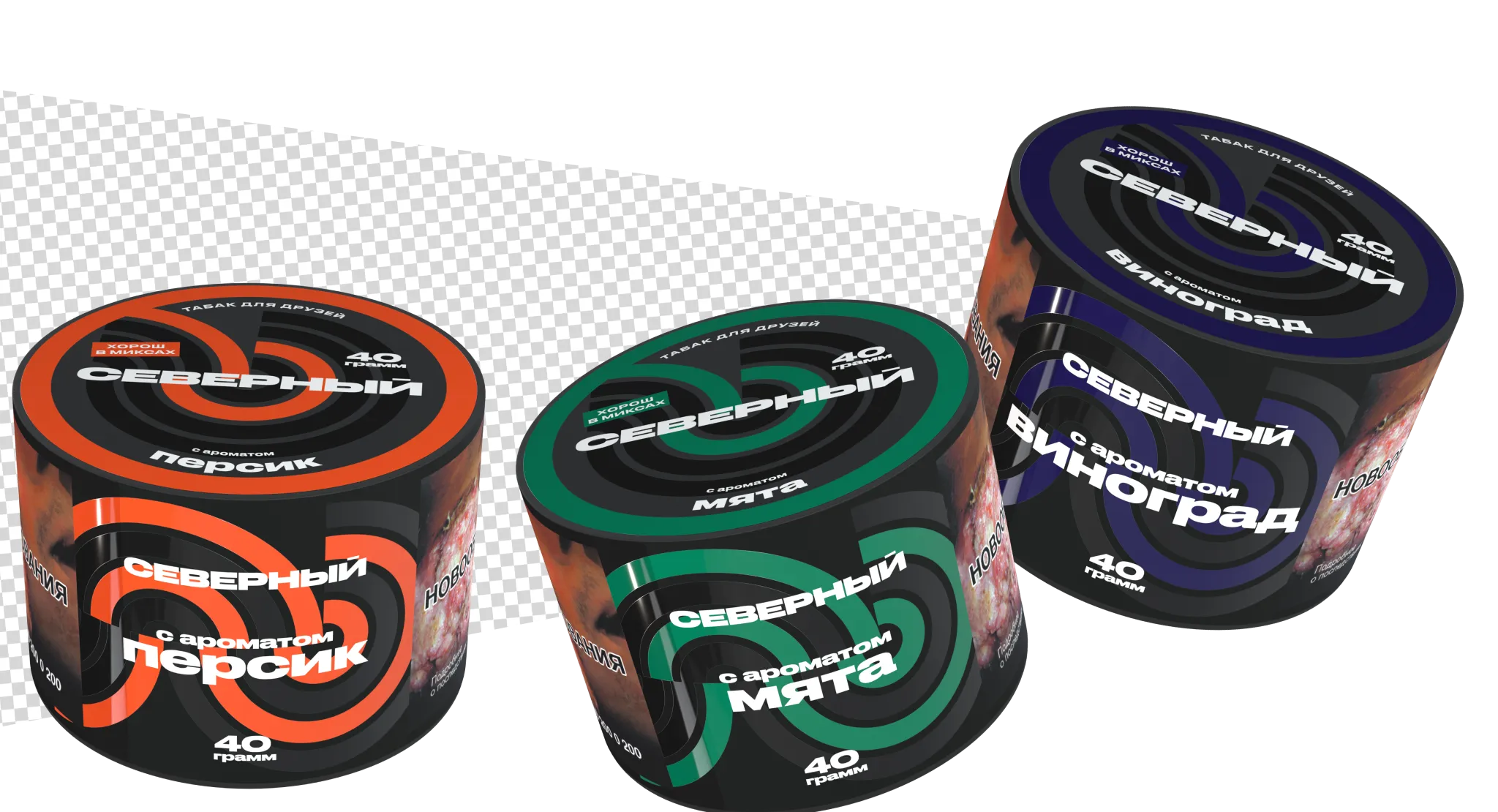
concept 4: wind, pattern
Geometric abstraction with a bold brutalist-inspired pattern creates a visual language where strict forms and saturated accents highlight the brand’s strength, monumentality, and resilience, turning simple elements into an expressive and memorable symbol.