


Task
to develop a corporate calendar for Cotton Logistics that would serve as both a functional and visually appealing branded item, suitable as a business gift and reflective of the logistics industry — movement, routes, speed, and reliability. as part of the project, several visual concepts were created, combining expressive graphics with a clear calendar grid and the brand’s visual identity.
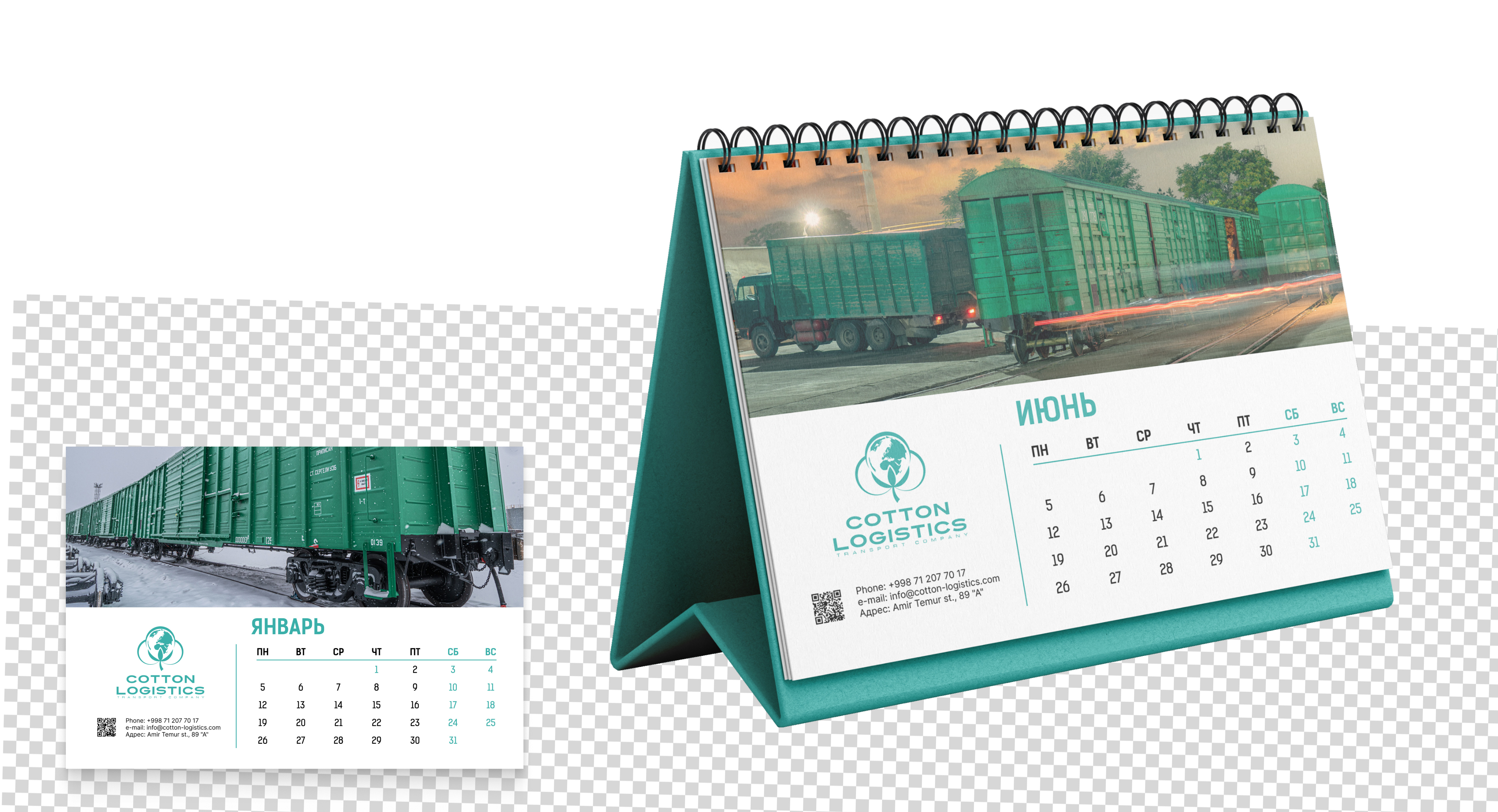
Concept 1
the design is built on the contrast between a strict modular grid and a bold, expressive hero image. the lower section is clean and functional, featuring the logo, contact details, and calendar grid. everything is aligned along a clear axis and executed in the brand’s signature color palette.
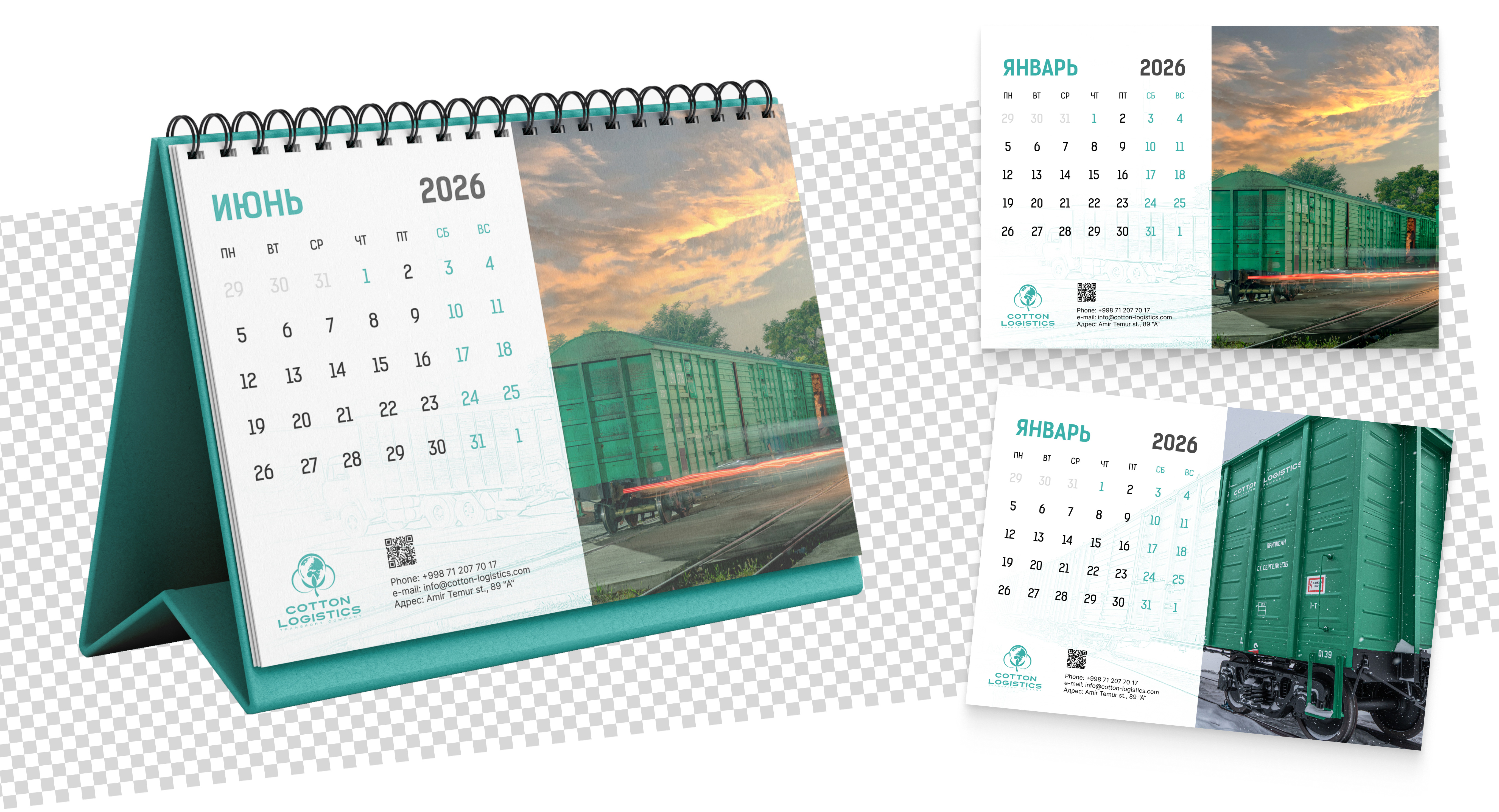
Concept 2
the layout is divided into two equal parts: on the left — a structured calendar grid and contact details, on the right — a bold visual image. a subtle graphic overlay featuring a train outline connects both sections, creating a cohesive composition and reinforcing the brand association.
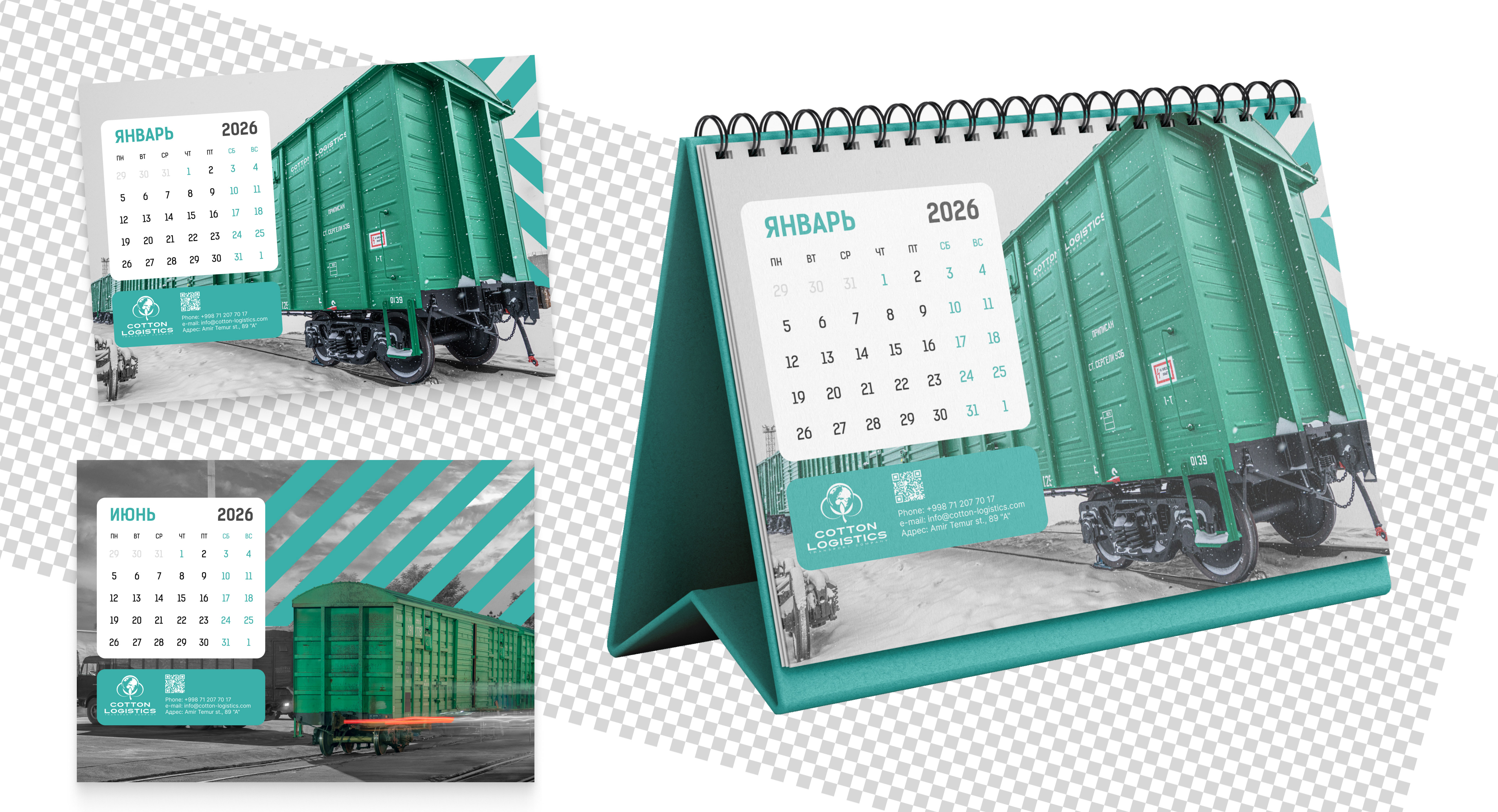
Concept 3
the key element of this concept is a diagonal pattern inspired by routes, direction, and speed. it connects photography with graphic elements, creating rhythm and a strong sense of movement. the monochrome background enhances the contrast and makes the brand’s green color stand out as a bold accent.
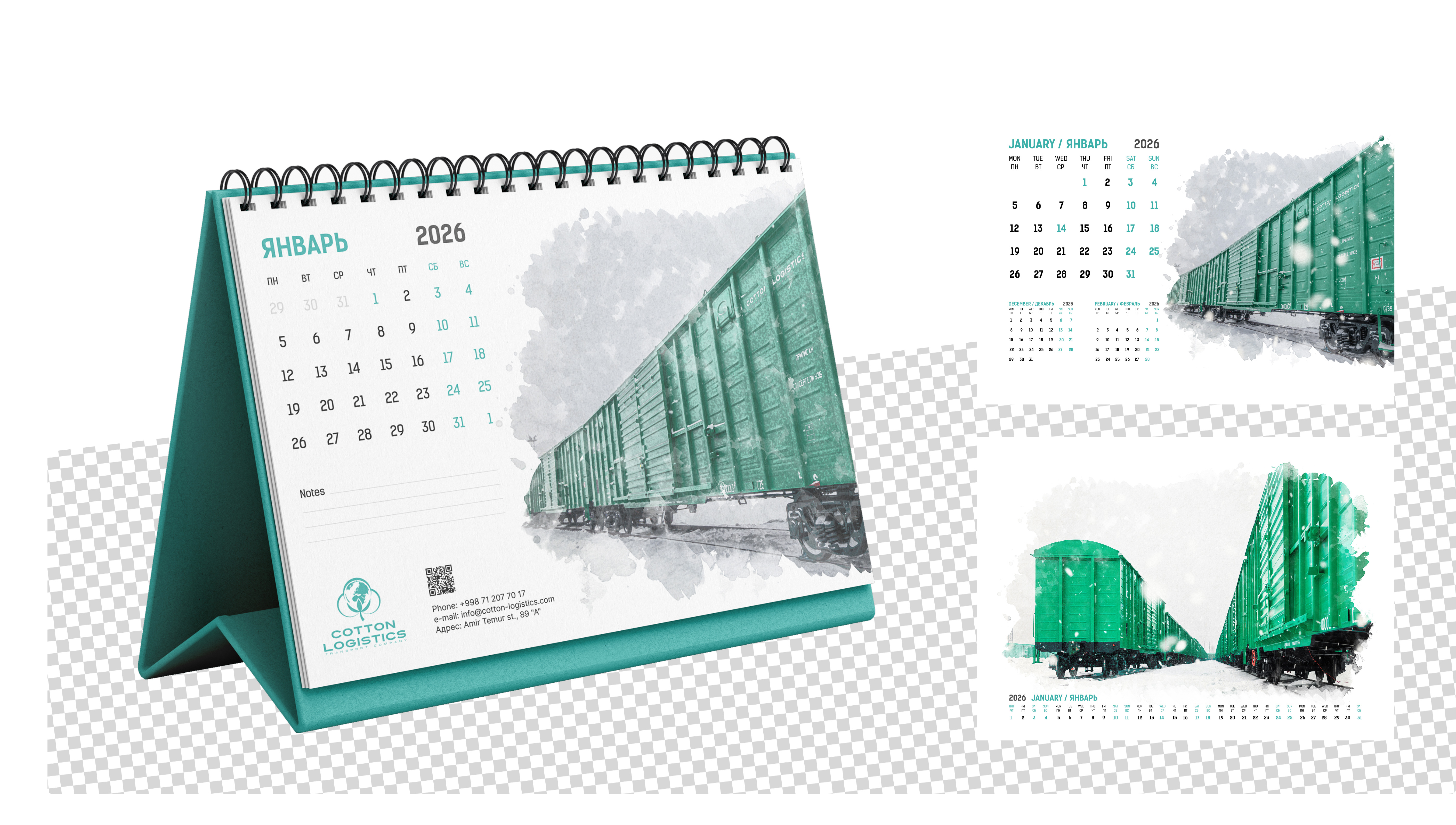
Concept 4
the visual style is built around a watercolor technique, giving the layout a more artistic and emotional feel. this approach softens the industrial nature of the logistics theme and turns the calendar into a more aesthetic and gift-worthy item. a notes section was also added to emphasize practicality.
