


about the project
BLAXURY is a jewelry brand with a fashionable, confident presentation, where boldness and self-irony combine with a sense of taste and luxury.
The brand's visual language is built on character, typography, and the feeling of living materials.
Task
Create a logo that looks modern and strong without resorting to luxury clichés — crowns, monograms, and excessive decorative elements.
It was important to maintain a balance between boldness and elegance, emphasize expressive typography, and ensure the logo's versatility for digital, print, and future media.
Solution
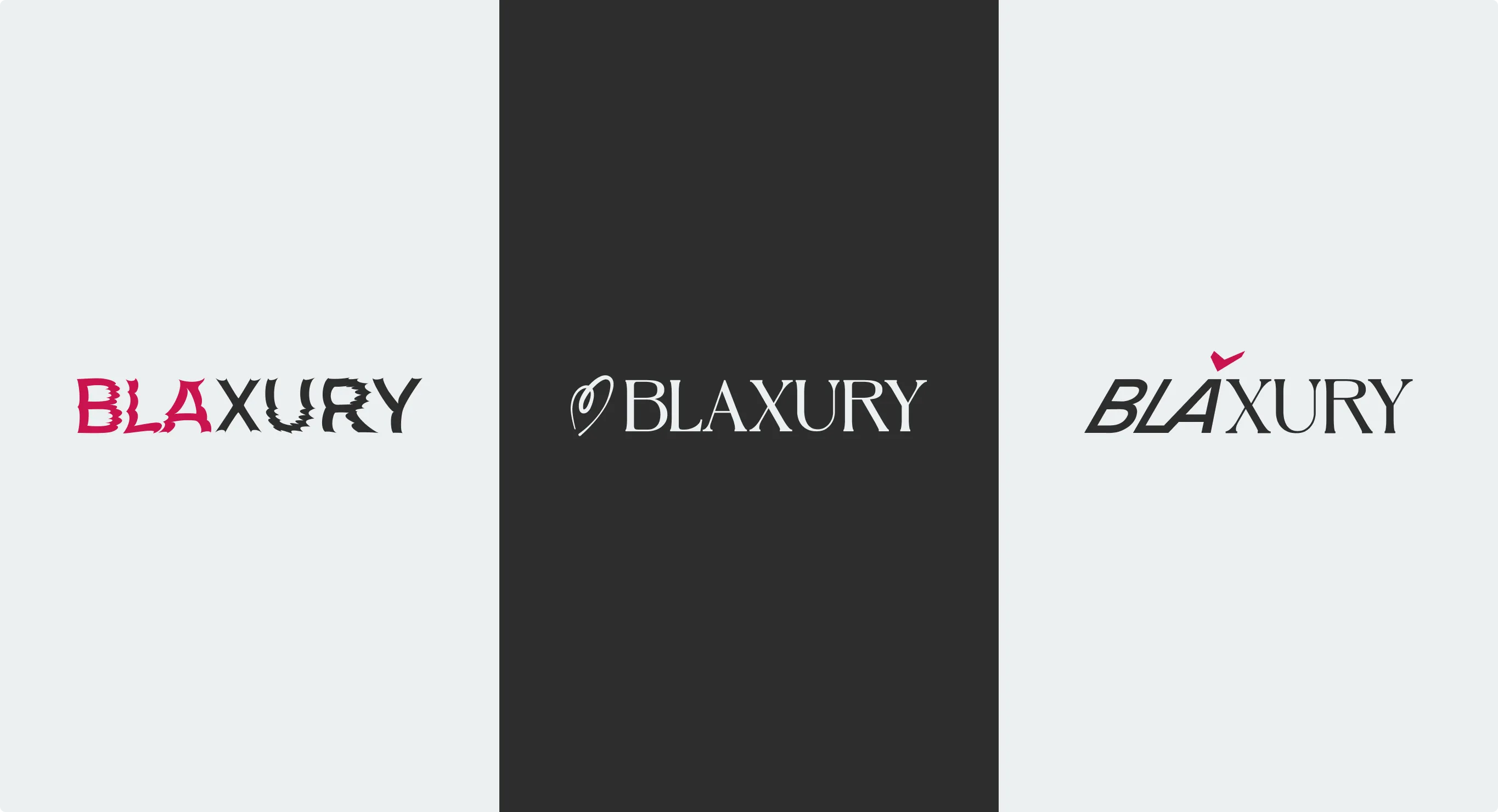
Three logo concepts with different moods were developed as part of the project.
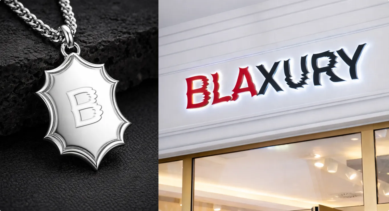
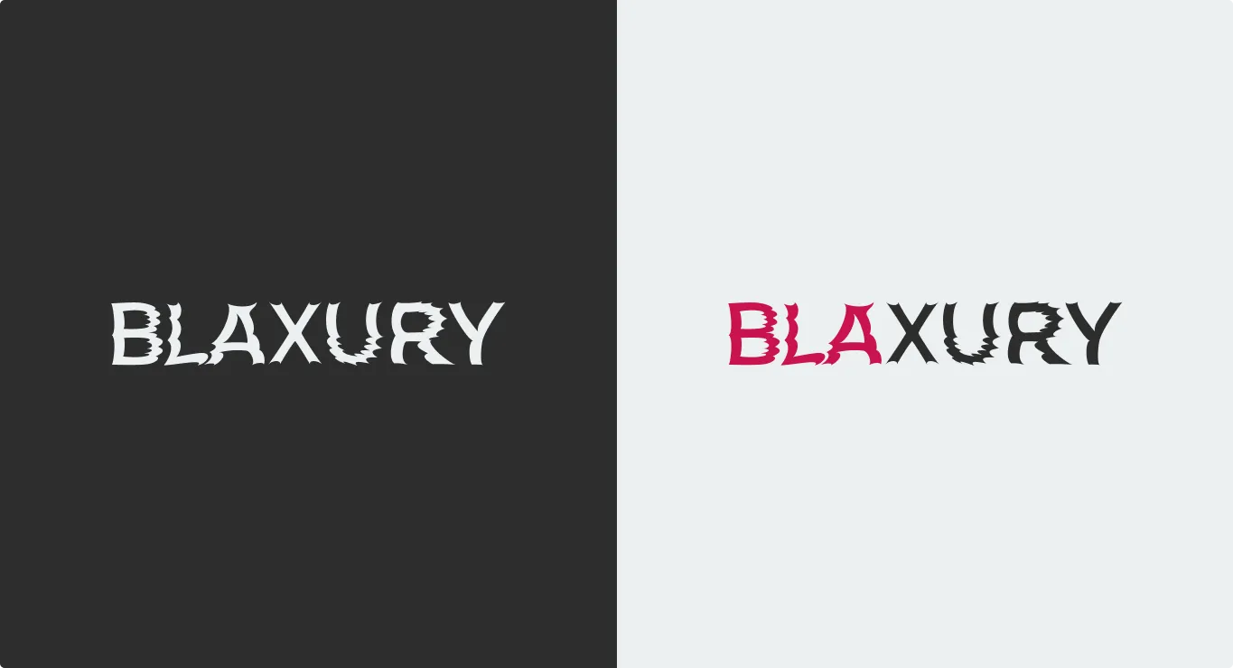
The final design chosen was «Predatory Elegance» — an image where softness and sharpness are combined in a single form.
Solution
Typography became a key element: the logo functions as a standalone visual object, conveying the brand's character without additional symbols.
The heart idea was abandoned in the final design, emphasizing the power of the letters.
process
Stage 1 — Briefing, Brand and Competitor Analysis
We delved into the brand's positioning, character, and ambitions. We analyzed the competitive landscape and the visual language of the fashion and jewelry segments.
Stage 2 — Visual Search
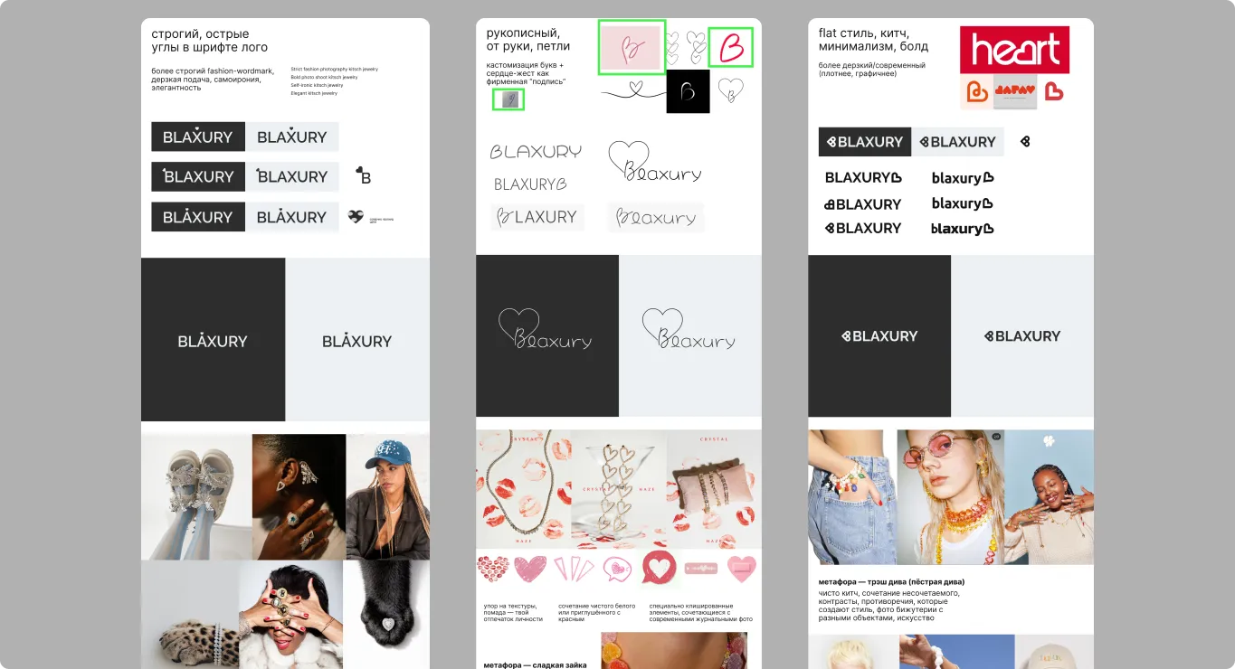
We collected references and mood boards, explored typography, and formed three different conceptual directions.

process
Stage 3 — Concept Development
We worked on the letterforms, rhythm, and flow.
We selected a font base and palette, and tested the level of sharpness and expressiveness.
We also explored patterns and icons to expand the visual system of each direction.
process
Stage 4 — Concept Presentation
1) Predatory Elegance — A contrast between softness and predatory strength
2) Luxury Kitsch — Vintage chic, excess, and the confident irony of a «rich woman».
3) Trash Diva — A daring art of contradictions and flamboyant excess.
The logo was presented in a competitive environment to assess its visual weight and character.

process
Stage 5 — Final Presentation
We compiled and structured the final project presentation.
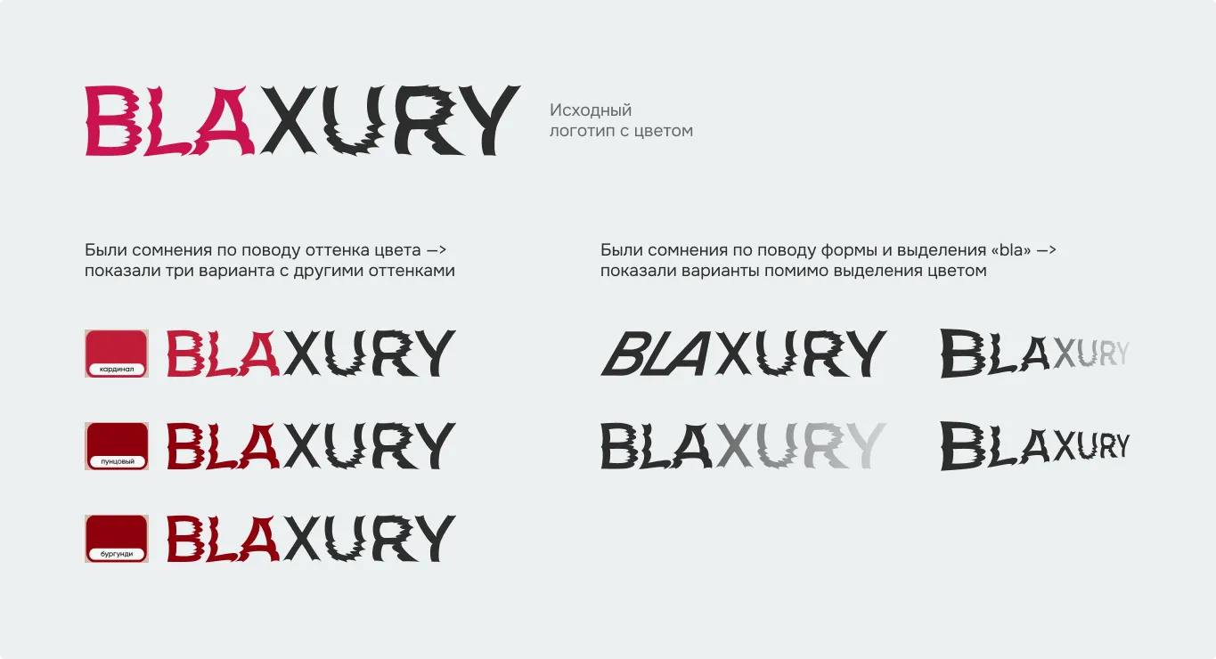
working with doubts
We prepared additional options upon request.
Ultimately, the initial concept was selected.
Result
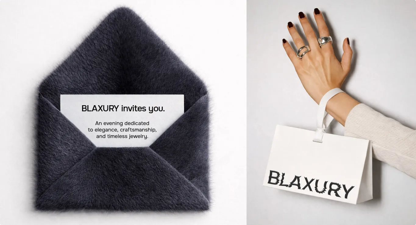
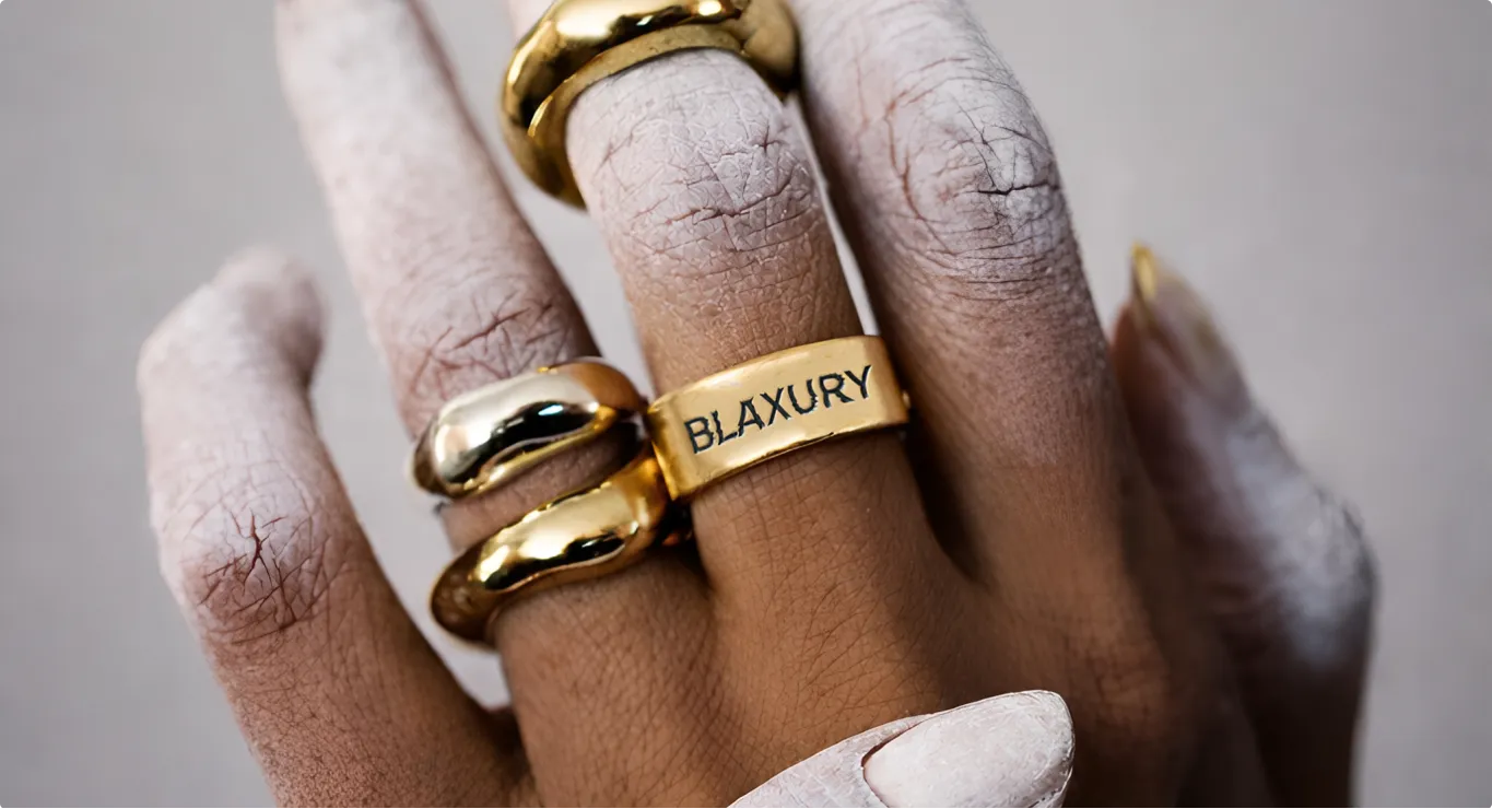
The final BLAXURY logo is an expressive typographic form with character, inner tension, and a vibrant shimmer.
It flexibly adapts to various media, fits seamlessly into fashion and jewelry contexts, and creates a recognizable visual identity for the brand without excessive pretension.
