

TASK
create a visual system for a jewelry brand at launch stage.

define its character, set the overall direction, and develop an identity that can scale.
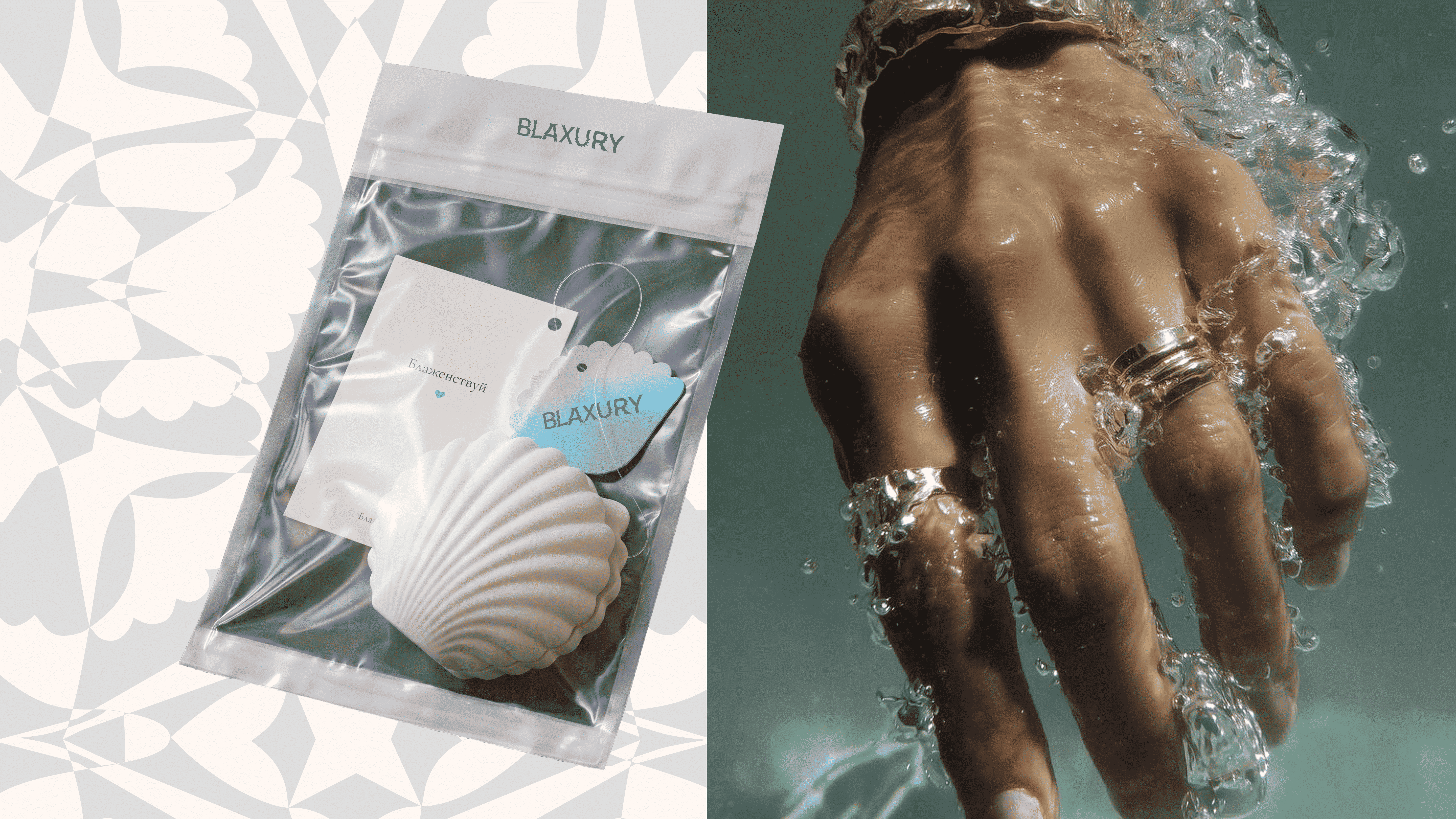
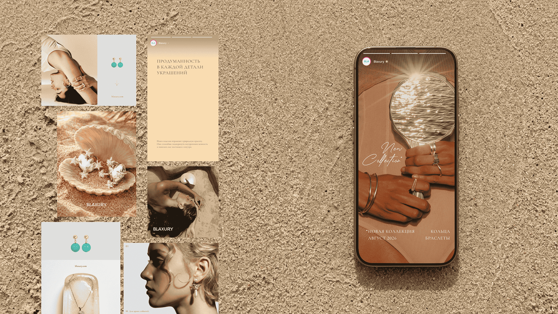
the system had to work across different touchpoints — from digital to packaging.

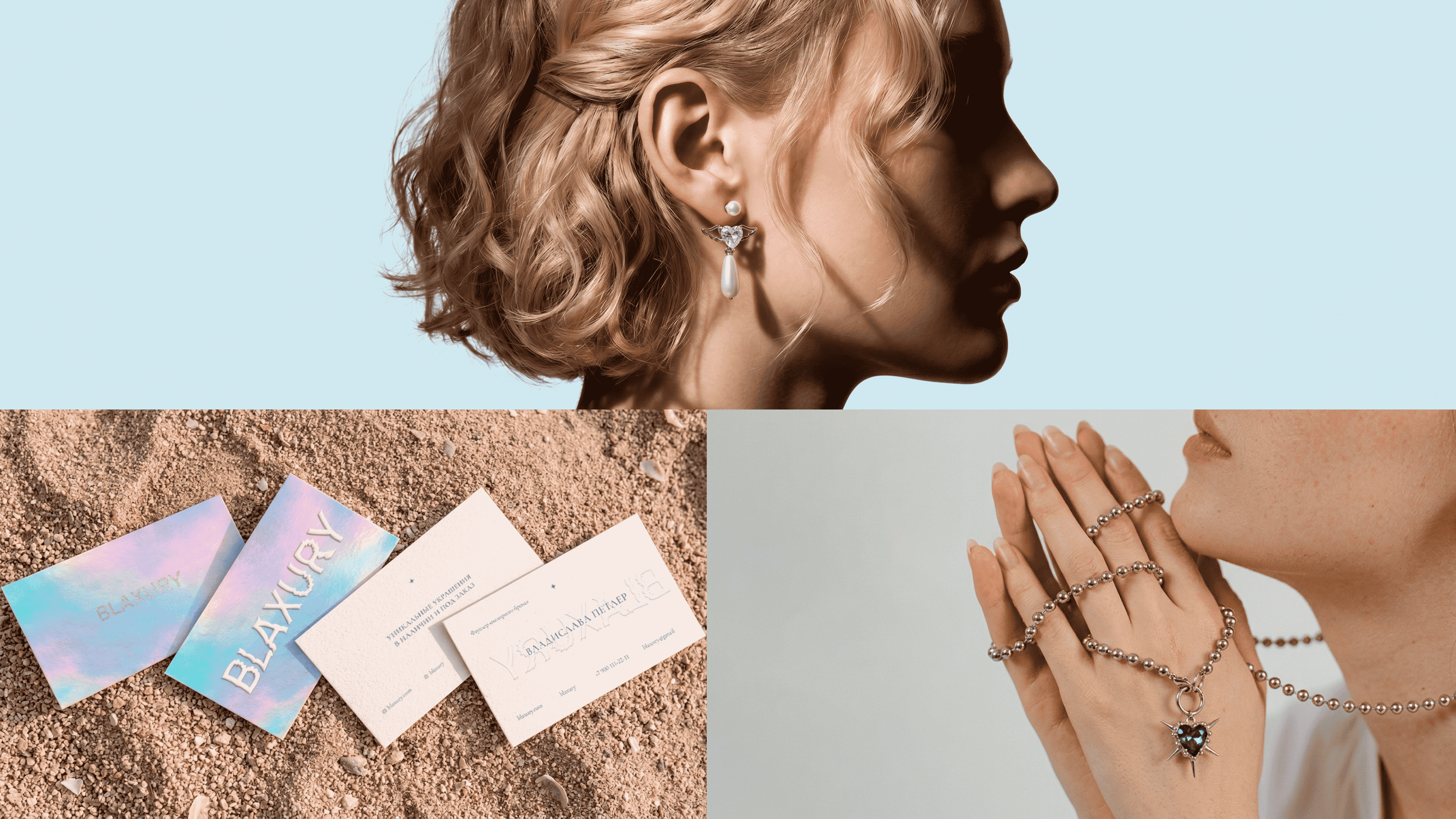
BLAXURY is a family brand whose name carries a personal code: B stands for Belosludtseva, L for Liza, and A for Alisa.

at its core is not an abstract idea, but a real story and the people behind it.
at the launch stage, the team did not yet have a formulated brand platform or a clear positioning. there was an understanding of the desired aesthetic and mood, but no system capable of holding it together.
the task was not only to create a visual identity, but also to establish the core brand principles the company could rely on going forward.

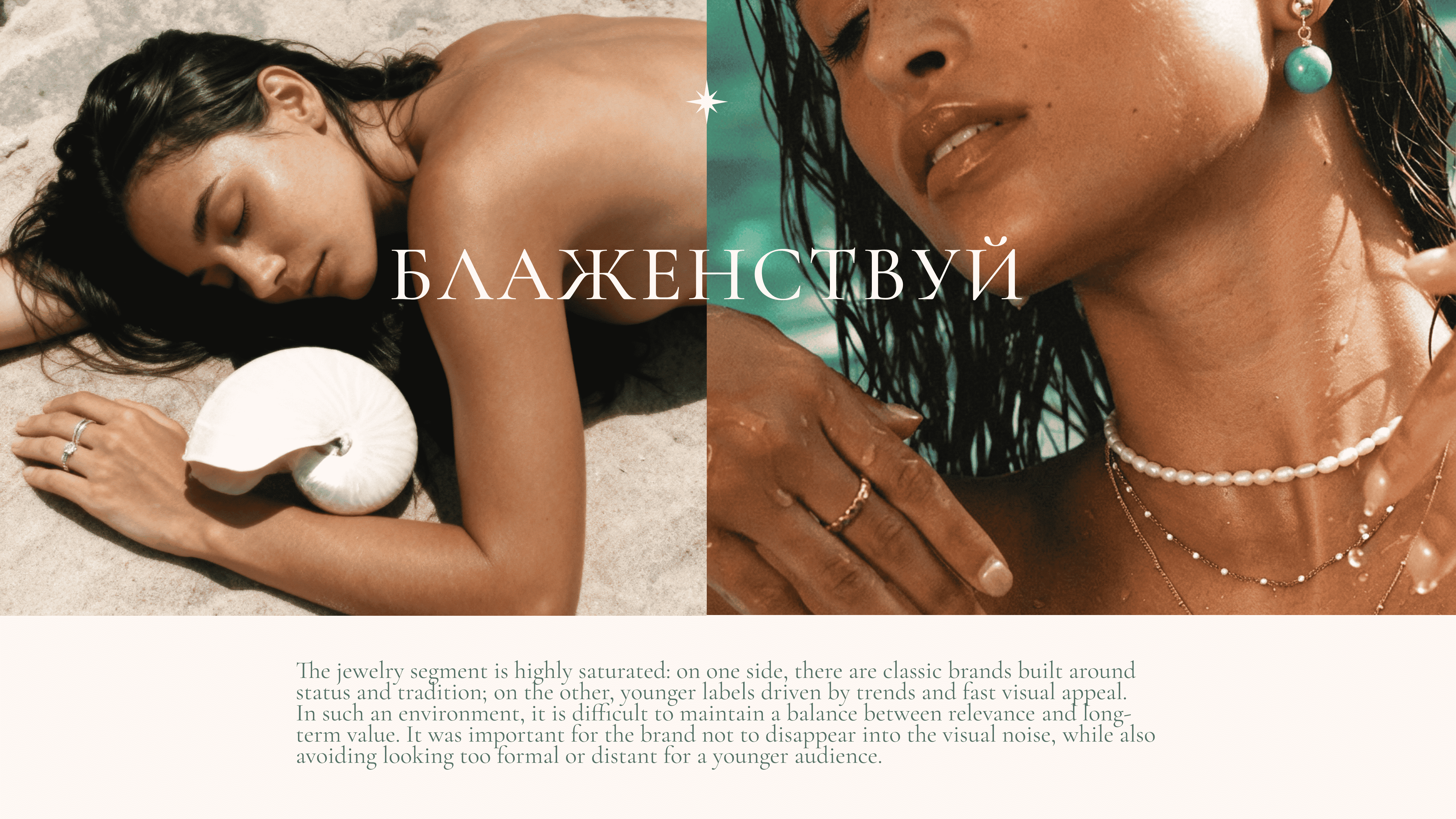
the jewelry segment is highly saturated: classic brands are built around status and tradition, while younger labels are driven by trends and fast visual appeal.
In this environment, it was important for Blaxury not to disappear into visual noise, while also avoiding looking too formal or distant for a younger audience.

we defined the brand’s character and key principles, then developed the identity system: logo, color, typography, and usage guidelines. we also tested the system across key touchpoints — from social media to packaging. as a result, BLAXURY received a cohesive and flexible visual system with a clear direction for consistent growth.
