

.webp)
Task
Azure traditionally produces hookah tobacco in a laminated pouch format. Our task was to adapt the brand to a new plastic jar format while preserving its recognizability and premium character. We developed three concepts and selected a signature classic direction based on strong geometry and clear color coding.
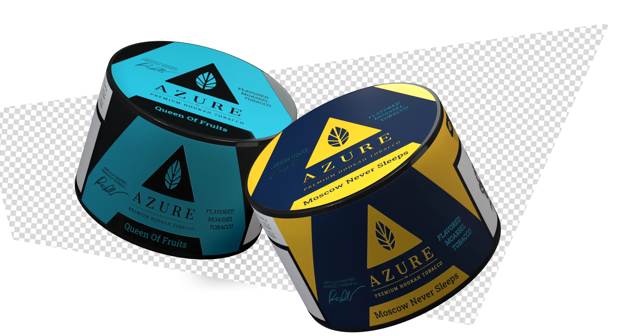
Concept #1
The core brand elements were preserved: the triangle, central composition, and precise color coding of the lines. In the jar format, the graphics became cleaner and more concentrated — the triangle was strengthened as the key symbol, and the structure was simplified to fit the new form. The result is a bolder, more shelf —expressive product without losing brand recognition.
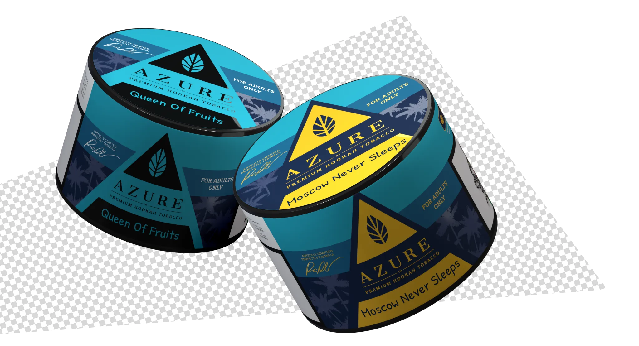
Concept #2
The horizontal logic of the original packaging was reinterpreted into structured color segments forming a cohesive composition. The contrast of the lines was enhanced through a larger-scale symbol and graphic accents — the visual identity became more refined, expressive, and confident in space.
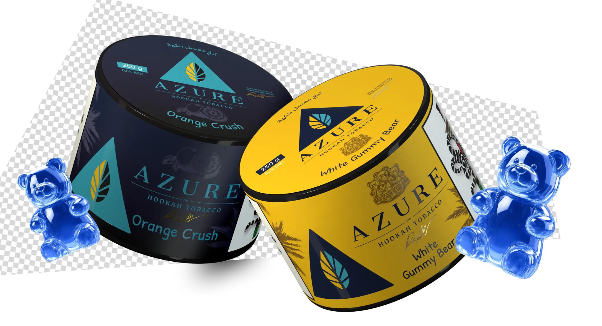
Concept #3
The concept is built on preserving the key symbol and signature composition, but in a cleaner and more consolidated graphic approach. The triangle is reinforced as the dominant element, color blocks became larger and more contrasting, and the typography more precise and confident. This is not a direct adaptation, but a more premium evolution of the label design while maintaining recognizability and brand character. Ultimately, this version was selected by the client for further implementation.
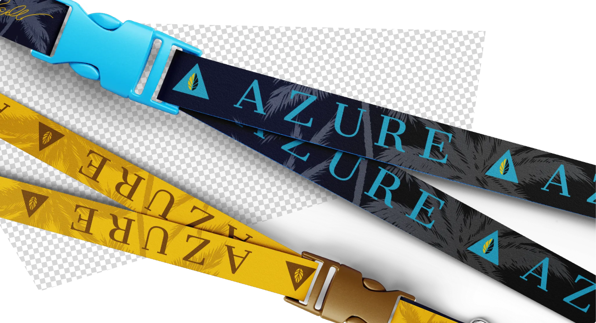
Lanyard
The lanyard was designed in the brand line colors with a repeated logo used as a rhythmic pattern. Core brand typography and a contrasting palette were applied to enhance visibility from a distance and maintain the integrity of the visual system.
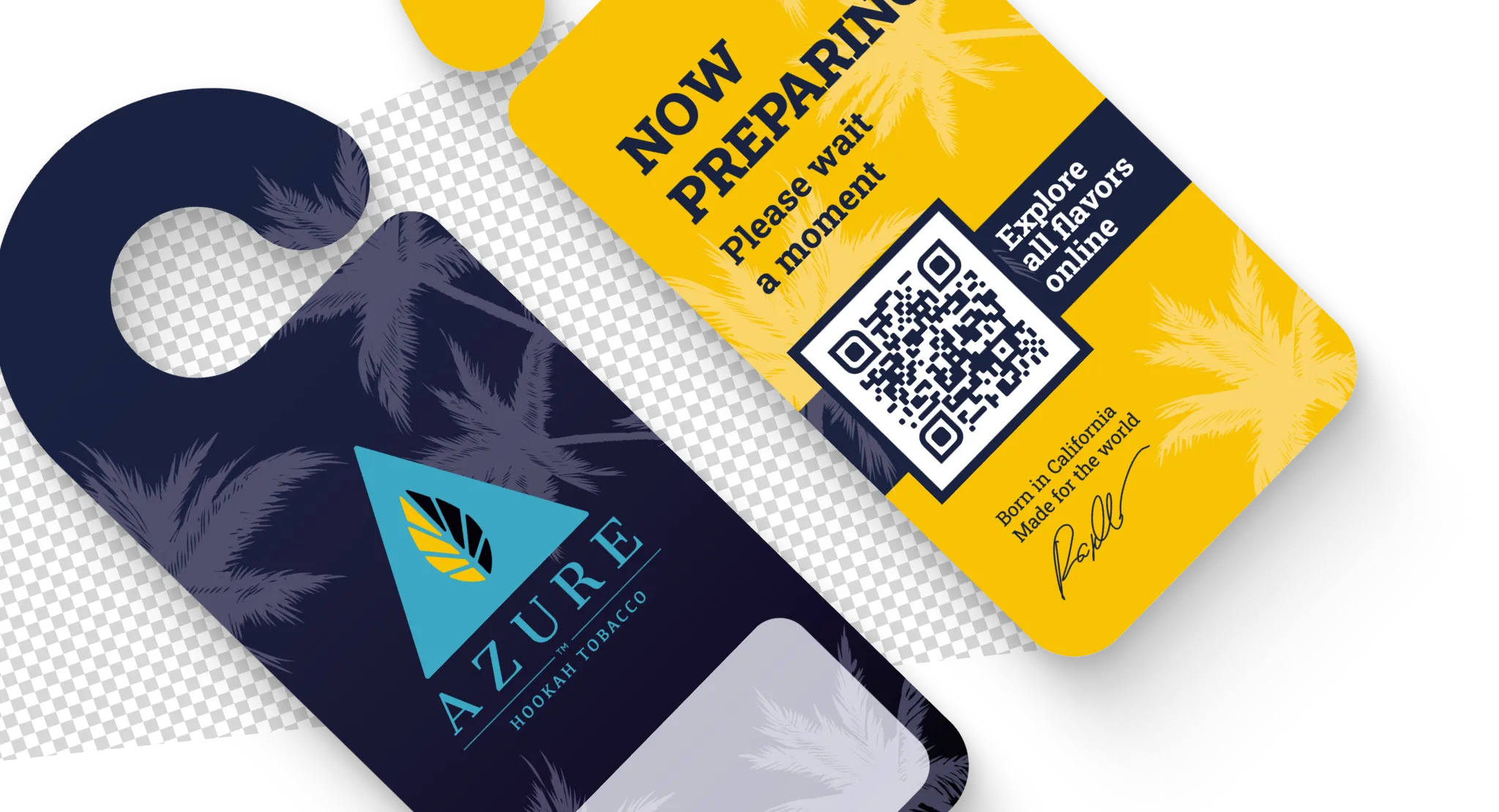
NeckHanger
The shape and composition follow the key packaging structure: a prominent logo, contrasting color blocks, and accent graphics. A clean signature area was integrated into the design without disrupting the brand identity.
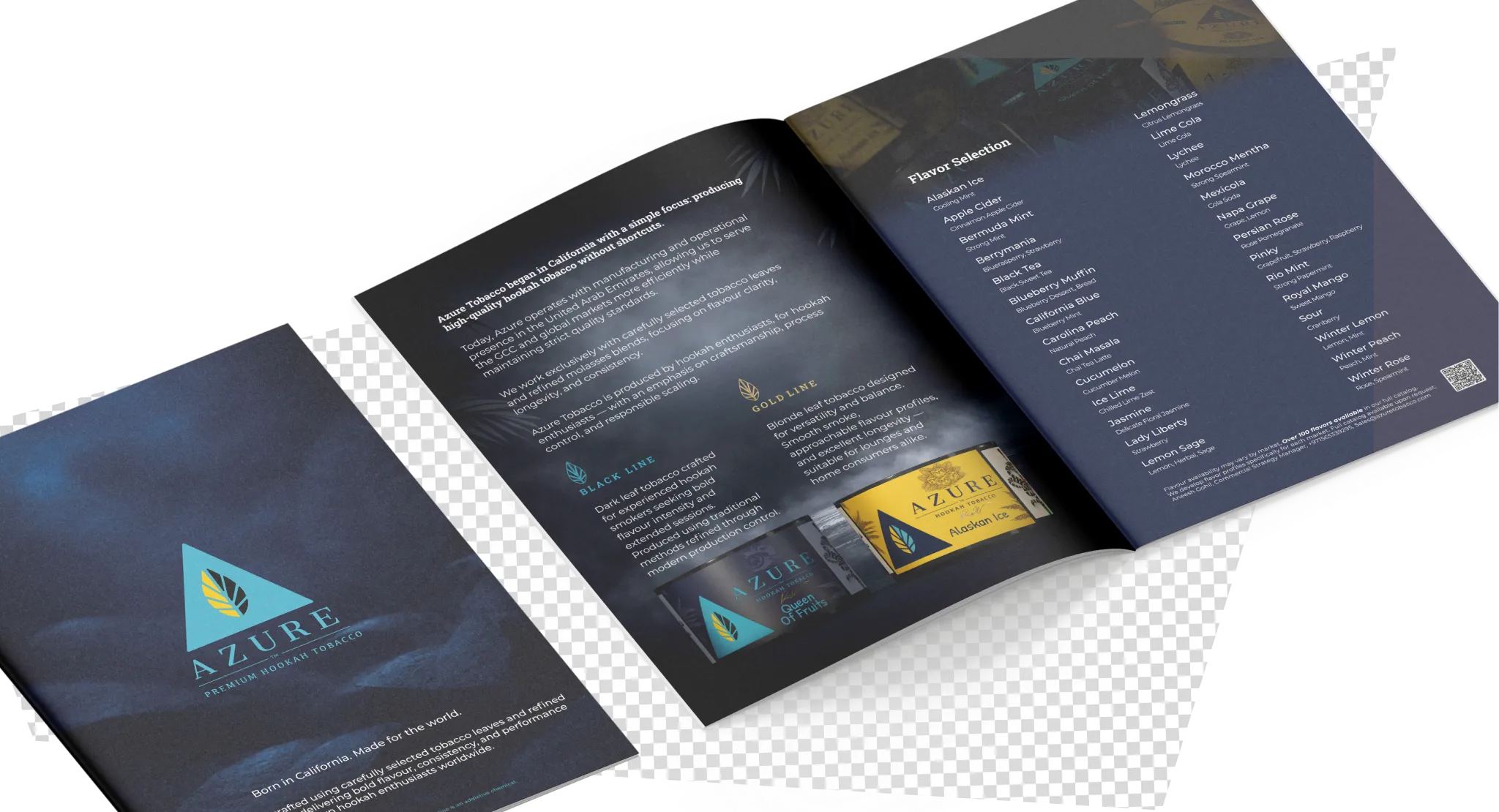
Brochure
The layout is built on the brand grid and Black / Gold color differentiation. Brand typography, a clear heading hierarchy, and a structured presentation of flavors and mixes were used. The brochure reinforces the system of the product lines and communicates the premium character of the brand through clean, well-balanced graphics.
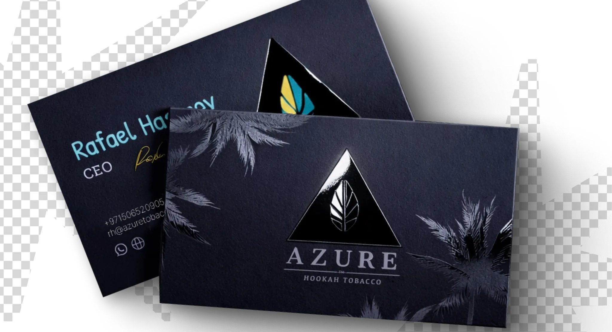
Business Cards
The cards were executed in a deep brand palette with selective spot varnish applied to the signature symbol and logo. The contrast between the matte surface and glossy logo enhances the premium feel and tactile perception while maintaining strict typography and visual consistency.
